In the latest blog post, "Stunning Westbury Kitchen Transformation," we explore the exquisite redesign of a kitchen that marries functionality with modern aesthetics. This transformation showcases the seamless integration of high-quality Italian cabinetry and custom millwork, delivering a space that is both beautiful and practical. Discover the design choices, innovative layout, and meticulous craftsmanship that brought this Westbury kitchen to life, elevating it into a culinary haven that meets the needs of today’s homeowners. Join us as we delve into the details that make this remodel a stunning example of sophisticated kitchen design.
Two for One: How to Brighten and Modernize your Kitchen and Bathroom
Remodeling your kitchen and bathroom unifies the home, creates consistency, and can even be economical! Read how we completely transformed these two spaces.
After Photo 1
Before:
The kitchen had low ceilings, a disjointed color scheme, and an overall dark and uninviting essence. The low hanging ceilings made the top cabinets seem short and dated. The floor plan was also interesting because the kitchen was very long in which the appliances and counter space all seemed to be side-by-side. In some cases, this can help a kitchen space seem larger, but because of the outdated features, the space was old, awkward, and not functional.
The outdated, drab, and dull space continued into the bathroom next to the kitchen and so the clients wanted us to remodel that space as well. Similarly, in the bathroom, there needed to be more light in the space as well as modern features to make the space feel more inviting and clean.
After
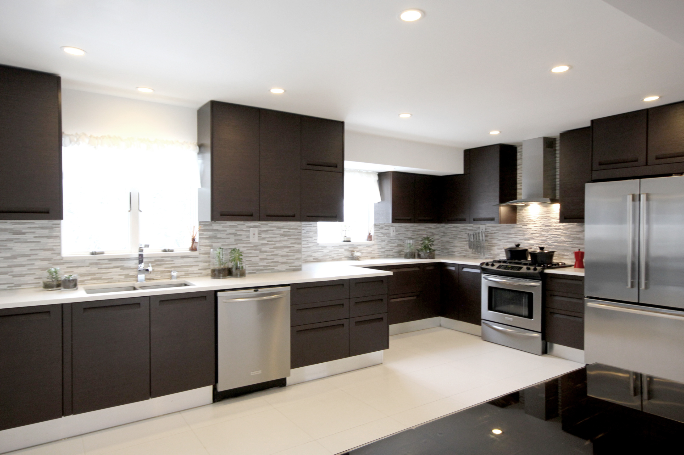
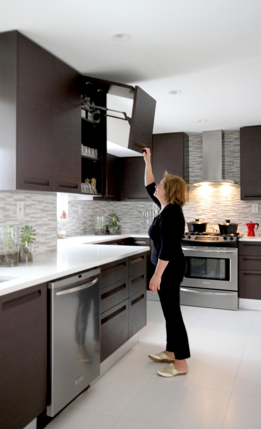
We enjoyed working on this space and designing a new layout for the kitchen. Our choice for the furnishing was one of our most timeless models that has textured dark-wood doors. The custom-designed cabinetry has integrated handles and soft closing blum hardware. The main objective for us was to maximize the use of space and make the room feel seamless, open and sleek. The old pantry with fixed shelving was replaced by a modern pull-out pantry system to achieve a more efficient organization solution. To brighten the space, we installed brand new white floor tiles and light backsplash which gave a luxurious feel to the whole space by creating contrast with the dark cabinetry.
One of the most important decisions for this renovation project was the removal of the low hanging ceiling with the old light fixtures and replacing them with recessed lighting. By removing the old ceiling, we were able to achieve more height and install taller top cabinets which not only accentuated the height of the space through their vertical lines but also provide more useful storage space. Finally, modern appliances were added as a finishing touch to tie the room together and make this space functional and beautiful.
In the bathroom, we completely gutted the space and installed a new vanity, shower, toilet, and medicine cabinet. We continued the colored scheme of the kitchen into the bathroom and made the space feel warm with the dark hues, but still light and open using the bright white sink and clean glass shower doors.


Overall, remodeling both rooms in the house can prove to be effective not only for a budget, but also for keeping consistency throughout the home.
How to Create Your Next Modern Kitchen Masterpiece
Check-out these 3 tips on how to transform your kitchen into a stunning, sleek, and chic contemporary kitchen
We recently completed a gorgeous full kitchen remodel for lovely clients in Brookville, New York. Read more below to find out about this luxurious and open contemporary kitchen and some simple tips on how it can be your next dream kitchen!
—Before—
Tip 1: Maximize your natural lighting!
Prior to the remodel by our team here at Teoria Interiors, this kitchen, despite its vast size and white cabinetry, had a dark and dismal feeling. The stark contrast between the white cabinets and the black flooring, backsplash, and island gave the space an overall disjointed feeling. Many times bright whites and deep blacks can be harsh on a space and make it uninviting and cold…unless the area is properly illuminated! That said:
Tip 2: Create fluidity in the floor plan!
The next aspect of the kitchen that needed to be fixed was the layout. While the kitchen did in fact have a large amount of counter space, the center island was small and had an awkward shape and the barstool section of the countertop jutted-out causing the space to have a weird and less-than-ideal layout. Keeping this in mind:
Tip 3: Modernize your appliances!
Finally, the homeowners wanted to upgrade their appliances and ensure that the space was functional and elegant and could be an environment in which they could entertain and host. By simply updating your appliances, the space will immediately feel newer and fresh. So:
—After—


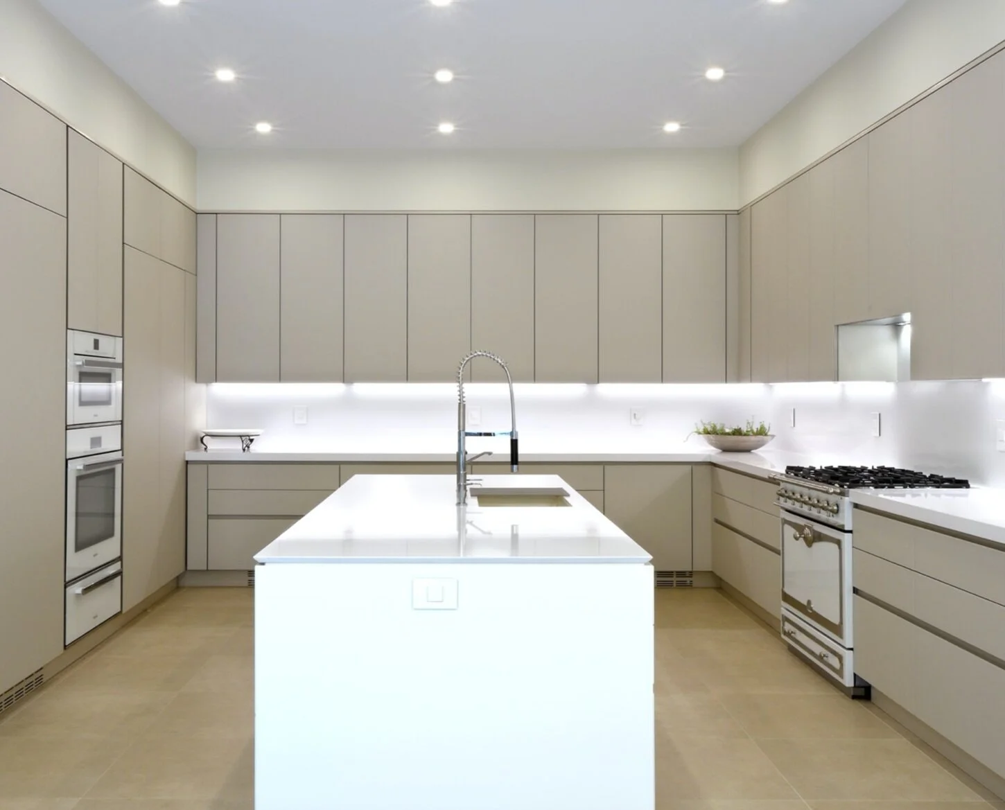
Post kitchen renovation clients had a completely updated, remodeled, and contemporary kitchen that exudes elegance, crispness, and warmth.
To brighten the kitchen using Tip 1, brand new beige colored custom Italian cabinetry by Teoria’s exclusive MK line, design Alias, was installed. The cabinetry is a matte glass finish and adds a gentle subdued elegance. The matte glass cabinetry is also fitted with 45 degree integrated handles for a sleek, clean, and modern look to provide homogeneity and coordination in the kitchen. By installing beige and cream-colored cabinetry and flooring you can make use of the existing natural light of the space and amplify its appearance. We also ensured that the new lighting under the wall cabinets added to its luminosity.
Implementing Tip 2, one of the first things we did was redesign the floor space and adjust the countertop and island layout. By enlarging the existing island, making it more rectangular, and removing the awkward wrap-around countertop that was on the side of the kitchen, the space instantly has a better fluidity that helps in maneuvering around the space. The change also makes the space more functional as well as creates depth. Since the kitchen did have a good amount of countertop space and cabinetry already we were able to take advantage of the preexisting conditions and maximize the storage even more. You will also notice that we continued the quartz countertop in a white color onto the backsplash to create consistency and keep the space unified.
Finally, we utilized Tip 3 and helped the client select brand new appliances, such as the Miele double oven, range, and Subzero Wolf brand refrigerator and wine coolers plus high-quality sink fixtures which add impeccable elegant detailing and accents.


